Saturday 3 September 2011

colour psychology

M.E (INDUSTRIAL DESIGN

Frank H. Mahnke, an environmental designer based in Geneva and San Diego and one of the world’s leading color consultants, would say it was no coincidence at all. “The public underestimates the impact color has on emotional states at home, at school, in workplaces, and in health-care facilities,” he says. Even many architects and interior designers, he adds, haven’t been trained in the psychological and physiological effects of color.

Alternative health practitioners, though, have long been attuned to the power of color. Their mission might not sound as technical as Mahnke’s, but they also believe that color can affect a person’s state of mind and perhaps even his or her health. Like aromatherapy, color awareness work teaches people to use an often-overlooked aspect of their senses to promote well-being.

In Berkeley, California, for example, teachers at the Buddhist Nyingma Institute draw on ancient Tibetan theories to explain the colors of the meditation room: midnight blue to calm the mind, with vertical lines of deep red to wake up the consciousness. The colors are a silent presence designed to move observers to states of compassion and wisdom. In Tempe, Arizona, lifestyle coach and registered nurse Nadine Campbell teaches clients to release tension and promote healing by looking at the colors associated with the seven chakras, or energy centers, and breathing deeply.

While no one’s claiming that color can cure cancer, science has established that color isn’t just pretty—it’s a mood-changing, blood-pressure-altering phenomenon. “Its most important use is for relaxation,” says Springfield, Missouri, physician Norm Shealy, founder of the American Holistic Medical Association. “And since 75 percent or more of illnesses are the result of stress, relaxing can help prevent them.”

Indeed, the effects of color can be profound, says Mahnke, who warns that we surround ourselves with drab at our peril. In his landmark book, Color and Light in Man-made Environments, coauthored with his father, Rudolf, he writes, “[People] subjected to [visual] under-stimulation showed symptoms of restlessness, excessive emotional response, difficulty in concentration, irritation, and, in some cases, a variety of more extreme reactions.”

More extreme reactions? I saw one of those in that long-ago dreary office: One day my boss pulled out a hammer and shattered a Lucite paperweight. Dingy paint was starting to sound like a legal defense.

To figure out what this means to the body, psychology researcher Robert Gerard, then at the University of California at Los Angeles, did an experiment in which he flashed red, blue, and white lights at research subjects. When subjects looked at the red light, their blood pressure rose, as did breathing rates, the amount of sweat on palms, and the frequency of eye-blinks. When subjects looked at blue light, their blood pressure dropped, as did the amount of blinking and breathing. In short, they mellowed.

Gerard proposed that the longer-wavelength colors—generally the “warm” colors like red, orange, and yellow—rev us up, while the “cooler colors,” which have shorter wavelengths, calm us down. It makes sense: This is why red is considered an aggressive, lively color and why the matador waves a red cape in front of the bull. As for the cool colors, I now understand the idea behind the “green room” where people at television studios wait before going on camera: It eases anxiety.

What’s your favorite color?
While our perception of warm and cool colors is thought to be universal, some quirks of color psychology are particular to each individual. According to Mahnke, we react to color by traveling a twisty path through our physical sensations, the collective unconscious, cultural norms, and finally, our specific personal history with a certain color. We may find white houses to be clean and fresh because we grew up in one, for instance, or find them sterile and dull for the same reason.

Your Color Horoscope
A preference for a certain color reveals much about your inner desires, according to the theories of German color psychologist Heinrich Frieling. To learn what color has to tell you, use this chart, developed by interior designer Debra A. Wade, and choose the shade you find most appealing. The text that matches that color shows qualities you have or would like more of in your life.

Turquoise. Insight, progressive thinking, healing.
Red. Self-motivation, leadership, generosity.
Chartreuse. Flexibility, growth, expansion.
Pink. Support, nurturance. sympathetic understanding.
Black. Self-sufficiency, individualism, protection.
Burgundy. Adventure, emotional play and expression.
Green. Clear perception, self-recognition, compassion.
Orange. Quick-thinking, intuition, independence.
Yellow. Communication, observation, analysis.
Blue. Clear thinking, diligence, organization.
Mint. Self-healing, tranquility, time-out.
Indigo. Self-reliance, clear and holistic thought.
White. Cleansing, protective, simplification.
Gray. Need a vacation, acute sensibility, calming.
Purple. Artistry, spirituality, culture.
Yellow Orange. Life-promoting creativity, quickness.

) @ PUNJAB ENGINEERING COLLEGE University of Technology, CHANDIGARH

Books

Operations Research, Taha, 8th ed, 2002, Prentice Hall


Tuesday 30 August 2011

Journals

  • 1.Researches on Digital Industrial Design System and its Application on Air Nailer Design Process

Xianfeng Jiang; Junyuan Li; Lei Liu;
Mech. Eng. Inst., Zhejiang Univ. of Technol., Hangzhou, China


This paper appears in: Measuring Technology and Mechatronics Automation (ICMTMA), 2010 International Conference on
Issue Date : 13-14 March 2010
Volume : 3
On page(s): 240 - 243

Print ISBN: 978-1-4244-5001-5

References Cited: 9
INSPEC Accession Number: 11286568
Digital Object Identifier : 10.1109/ICMTMA.2010.465
Date of Current Version : 06 May 2010

Yuxiang Kuang
Dept. of Ind. Design, Jiangxi Univ. of Finance & Econ., China

This paper appears in: Computer-Aided Industrial Design and Conceptual Design, 2008. CAID/CD 2008. 9th International Conference on
Issue Date: 22-25 Nov. 2008
On page(s): 998 - 1001
Location: Kunming
Print ISBN: 978-1-4244-3290-5
INSPEC Accession Number: 10439879
Digital Object Identifier: 10.1109/CAIDCD.2008.4730729

Date of Current Version: 30 December 2008

2.Educational practice in China originated from German Bauhaus—Exploration on German model of industrial design program

Xun Xu;
Sch. of Art & Design, Zhejiang Univ. of Sci. & Technol., Hangzhou, China


This paper appears in: Computer-Aided Industrial Design & Conceptual Design, 2009. CAID & CD 2009. IEEE 10th International Conference on
Issue Date : 26-29 Nov. 2009
On page(s): 395 - 397
Print ISBN: 978-1-4244-5266-8
References Cited: 4
INSPEC Accession Number: 11084142
Digital Object Identifier : 10.1109/CAIDCD.2009.5375419
Date of Current Version : 08 January 2010

Tingliang Guo; Yanfeng Wang;

3.The Effect of User-Centered Principles on Industrial Product Design

Sch. of Mech. Eng., HuaiHai Inst. of Technol., Lianyungang, China

Tingliang Guo; Yanfeng Wang;


This paper appears in: System Science, Engineering Design and Manufacturing Informatization (ICSEM), 2010 International Conference on
Issue Date : 12-14 Nov. 2010
Volume : 1
On page(s): 89 - 92
Print ISBN: 978-1-4244-8664-9
References Cited: 3
INSPEC Accession Number: 11661800
Digital Object Identifier : 10.1109/ICSEM.2010.30
Date of Current Version : 18 November 2010

Sch. of Mech. Eng., HuaiHai Inst. of Technol., Lianyungang, China

4.Industrial design process composition based design tree

This paper appears in: System Science, Engineering Design and Manufacturing Informatization (ICSEM), 2010 International Conference on
Issue Date : 12-14 Nov. 2010
Volume : 1
On page(s): 89 - 92
Print ISBN: 978-1-4244-8664-9
References Cited: 3
INSPEC Accession Number: 11661800
Digital Object Identifier : 10.1109/ICSEM.2010.30
Date of Current Version : 18 November 2010

5.Some thoughts on 3D graphics software and industrial design education

Liqing Huang; Mingzhu Li;
Sch. of Art, Jiangsu Univ., Zhenjiang, China


This paper appears in: Computer-Aided Industrial Design & Conceptual Design, 2009. CAID & CD 2009. IEEE 10th International Conference on
Issue Date : 26-29 Nov. 2009
On page(s): 165 - 167
Print ISBN: 978-1-4244-5266-8
References Cited: 5
INSPEC Accession Number: 11057405
Digital Object Identifier : 10.1109/CAIDCD.2009.5375150
Date of Current Version : 08 January 2010

6.A study on the developing tendency of industrial design education with national characteristic based on the theory of Bauhaus

Baiying Yu;
Sch. of Arts, Jiangxi Univ. of Finance & Econ., Nanchang, China


This paper appears in: Computer-Aided Industrial Design & Conceptual Design, 2009. CAID & CD 2009. IEEE 10th International Conference on
Issue Date : 26-29 Nov. 2009
On page(s): 236 - 239
Print ISBN: 978-1-4244-5266-8
References Cited: 6
INSPEC Accession Number: 11057386
Digital Object Identifier : 10.1109/CAIDCD.2009.5375131
Date of Current Version : 08 January 2010


M.E (INDUSTRIAL DESIGN) @ PUNJAB ENGINEERING COLLEGE University of Technology, CHANDIGARH

World Industrial Design Day

http://www.icsid.org/projects/world_industrial_design_day.htm

Colour Psychology by Max Lüscher

Max Lüscher (born 9 September 1923, Basel, Switzerland) is a Swiss psychotherapist. He's known for inventing the Luscher colour test, a tool for measuring the person's psychophysical state based on his or her colour preferences. Besides research, teaching and practicing psychotherapy in Basel, Lüscher worked for international companies, amongst other things giving colour advice. His book "The Lüscher Test" has been translated into more than 30 languages.

The area of prime importance to the Lüscher research is the effect of colours on humans with regard to the psychological social aspects as well as the psychology of colours and advice for industry and firms.

The Lüscher colour test

The Lüscher colour test is a psychological test invented by Dr. Max Lüscher in Basel, Switzerland. Max Lüscher believed that sensory perception of colour is objective and universally shared by all, but that colour are subjective, and that this distinction allows subjective states to be objectively measured by using test colours.

Lüscher believed that because the colour selections are guided in an unconscious manner, they reveal the person as they really are, not as they perceive themselves or would like to be perceived.

The results of the Lüscher-Colour-Diagnostic contain indications pertaining to personal assessment and special, professional recommendations as to how psychological stress and the resulting physical symptoms can be avoided. It also offers additional information for verbal and homeopathic therapy.

Proponents of the test claim this method allows a rapid and deep personality analysis from only this colour ranking information.

The test-colours from the Lüscher Colour-Diagnosis are selected according to the same category. Therefore the patient’s choice of colour shows the state of their psychosomatic and emotional status and how they feel about themselves. It is further one of many well known test-diagnostic proceedings by testing children on the area of educational psychology.

Lüscher relates to his four fundamental colours to the following fundamental categories:

Red: Self confidence.

Activity, drive and the reaction to challenges.

"How I react to challenges"


Blue: Contentment.

Feeling of belonging, the inner connection and the relationship to one’s partner.

"How I feel towards a person that is close to me"

Yellow: Development.

Attitude of anticipation, attitude towards future development and towards new encounters.

"What I expect for the future"

Green: Self-respect.

Inner control of willpower and the capacity to enjoy.

"The way I want to be"


Give a colour test: http://www.colorquiz.com/


Sunday 28 August 2011

The Golden ratio

The Golden Section is a ratio based on a phi

The Golden Section is also known as the Golden Mean, Golden Ratio and Divine Proportion. It is a ratio or proportion defined by the number Phi ( = 1.618033988749895... )

It can be derived with a number of geometric constructions, each of which divides a line segment at the unique point where:

the ratio of the whole line (A) to the large segment (B)

is the same as

the ratio of the large segment (B) to the small segment (C).

Sectioning a line to form the Golden Section, based on phi, the golden ratio

In other words, A is to B as B is to C.

This occurs only where A is 1.618 ... times B and B is 1.618 ... times C

.

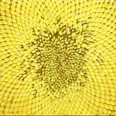
Who could have guessed that this innocent-looking line division would have implications for numerous natural phenomena ranging from the leaf and seed arrangements of plants to the structure of the crystals of some aluminium alloys, and from the arts to the stock market?

Sunflower seeds

Sunflower seeds

In fact, with the increasing realization of the astonishing properties of this number over the centuries since Euclid's definition, the number was given the honorifics "Divine Proportion" and "Golden Ratio."

Here I shall concentrate only on one of the surprising (claimed) attributes of the Golden Ratio - its presumed association with aesthetics, since it provides a wonderful example of an attempt to mingle mathematics with the arts.


The golden ratio in the arts

Leonardo da Vinci's Mona Lisa, the ratio of the height to width of that rectangle is equal to the Golden Ratio. No documentation exists to indicate that Leonardo consciously used the Golden Ratio in the Mona Lisa's composition, nor to where precisely the rectangle should be drawn.Sacrament of the Last Supper, by Salvador Dali

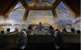
Sacrament of the Last Supper, by Salvador Dali

Another painter, about whom there is very little doubt that he actually did deliberately include the Golden Ratio in his art, is the surrealist Salvador Dali. The ratio of the dimensions of Dali's painting Sacrament of the Last Supper is equal to the Golden Ratio. Dali also incorporated in the painting a huge dodecahedron (a twelve-faced Platonic solid in which each side is a pentagon) engulfing the supper table. The dodecahedron, which according to Plato is the solid "which the god used for embroidering the constellations on the whole heaven," is intimately related to the Golden Ratio - both the surface area and the volume of a dodecahedron of unit edge length are simple functions of the Golden Ratio.

Is beauty in the eye of the beholder?

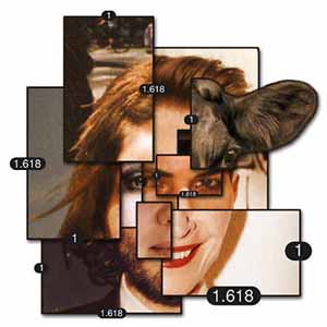
composite faceThe pioneering (rather crude) experiments in this field were conducted by the German physicist and psychologist Gustav Theodor Fechner in the 1860s. Fechner's experiment was simple: ten rectangles varying in their length-to-width ratios were placed in front of a subject, who was asked to select the most pleasing one. The results showed that 76% of all choices centered on the three rectangles having ratios of 1.75, 1.62, and 1.50, with a peak at the "Golden Rectangle" (with ratio 1.62). Fechner went further and measured the dimensions of thousands of rectangular-shaped objects (windows, picture frames in the museums, books in the library), and claimed (in his bookVorschule der Aesthetik) to have found the average ratio to be close to the Golden Ratio.
Golden in Product Design
When asked about the significance and the characteristics of a symbol or a logo, most people would say it is a mean of representing their business to their target market. I agree. But how? What are the bases of constructing one such logo which can maintain the balance and successfully project everything about your business at the same time? This is where Golden ratio comes in to play.

Let’s take the example of Toyota motors logo. The current Toyota logo consists of three ovals; the two perpendicular ovals actually represent a relationship between the customers and Toyota. These two ovals combine to form a “T” which stands for Toyota. The space in the back emphasizes the potential expansion of Toyota. Taking a closer look one can easily find the application of the golden ratio within their logo.


The ratio between the two halves of the logo, both horizontally and vertically is approximately 1.613, which is less than half of a millimeter from the Golden Ratio value. As I mentioned above the two ovals represent the relationship between the customers and Toyota itself which means they are maintaining a Golden ratio or a Divine proportion between them and their customers through their logo branding strategy.
The Pepsi brand is created by intersecting circles with a set proportion to each other. The ratio is created by two simple circles that are in a set ratio to each other: The Golden Ratio.

Apple was selling only around 6 million iPods by the year 2005 and in 2006 their sales went up to 14 million iPods all of a sudden. What is it that they did to their product? Along with other changes they actually transformed their product look using the same golden ratio principle.

The hottest product which they had in 2005 was NANO 1G IPod and as soon as they launch the classic 5g model their sales jump up by 2 times. Among other things which they did to their product design was the application of this golden ratio.


From then onwards IPOD never launched a design which doesn’t incorporate the result of the lesson they learned about the Golden Ratio principle and the designs of all their products have been swinging around the actual golden ratio.


M.E (INDUSTRIAL DESIGN) @ PUNJAB ENGINEERING COLLEGE University of Technology, CHANDIGARH